Pool, Spa, Patio, and Deck Expo
The Client
The International Pool | Spa | Patio Expo, co-located with Deck Expo (PSP/Deck Expo), is the largest gathering of pool, spa, patio, decking, and outdoor living professionals in North America. Owned and produced by Informa Markets and endorsed by the industry’s leading associations: PHTA, GENESIS, and NADRA. The show has been investing in the industry since the late 1950s. Coming off a strong rebuilding year, PSP/Deck Expo came to Bluecap to close the gap between the quality of the event and the quality of its brand.
The Challenge
PSP/Deck Expo faced a positioning issue masked as a perception problem. It was the #1 show in its category, larger than regional events, with a truly international audience and comprehensive education and sourcing. However, the market saw it as just a show, not THE show. Its experience matched its reputation, but marketing lagged. Three issues needed resolving: messaging and visual identity were behind the quality; the 2020 co-location with Deck Expo required appealing to pool/spa and deck pros equally, but decks felt underrepresented; and, with an 80%-male, builder- and service-heavy audience, earlier creative was too soft. All this had to fit within a fixed logo lock-up, a lean digital strategy, and be well-documented for ongoing use.
Objectives
- Refresh the brand so its marketing matched the quality and status of the #1 show in the industry.
- Resolve the co-location identity — give pool/spa and deck audiences equal footing in one brand.
- Skew the identity confident and masculine to match the real audience, without tipping into cliché.
- Build a documented, flexible system deployable across print, digital, and on-site environments.
- Increase brand awareness, site traffic, attendance, and exhibitor square footage.
Strategy & Execution
- Brief as the source of truth — We treated the client’s incredibly thorough creative brief (audience psychographics, competitor teardowns, brand archetype, mood boards) as the map, letting us move fast into real concepts instead of re-discovering the audience.
- Four real directions — Round 1 presented four distinct territories: Mosaic Art, Go With the Flow, Bright Future, and Waterline. Each contained its own palette, typography, and applications, giving the client a genuine decision rather than one safe option and two decoys.
- Listened, then narrowed — We took specific feedback literally: fewer blues and more contrast, drop the purples and mosaic (too feminine for an 80%-male audience), keep the handwritten font but skew it masculine, and represent the deck side with audience-specific artwork.
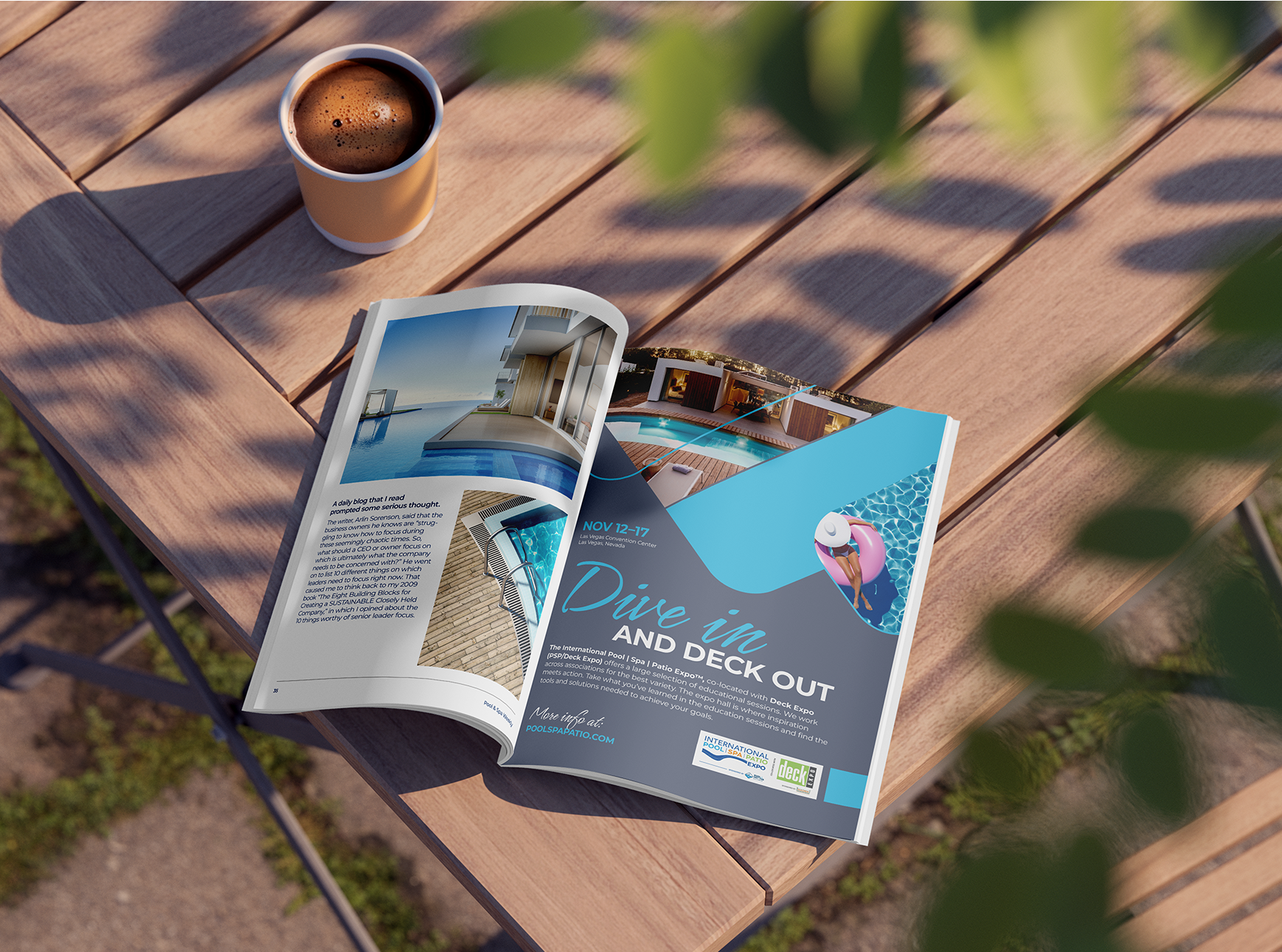
- The tagline breakthrough — “Make a Splash” skewed pool-only and “Reunite” had expired. We landed “Dive In and Deck Out." A play on words that carries the water feel and the invitation to join, while “deck out” speaks to both decking and the custom work exhibitors show off. It resolved the co-location tension in four words.
- A documented brand system — We delivered full Brand Guidelines on Frontify and in PDF format for easy distribution plus the Web/UI style guide.
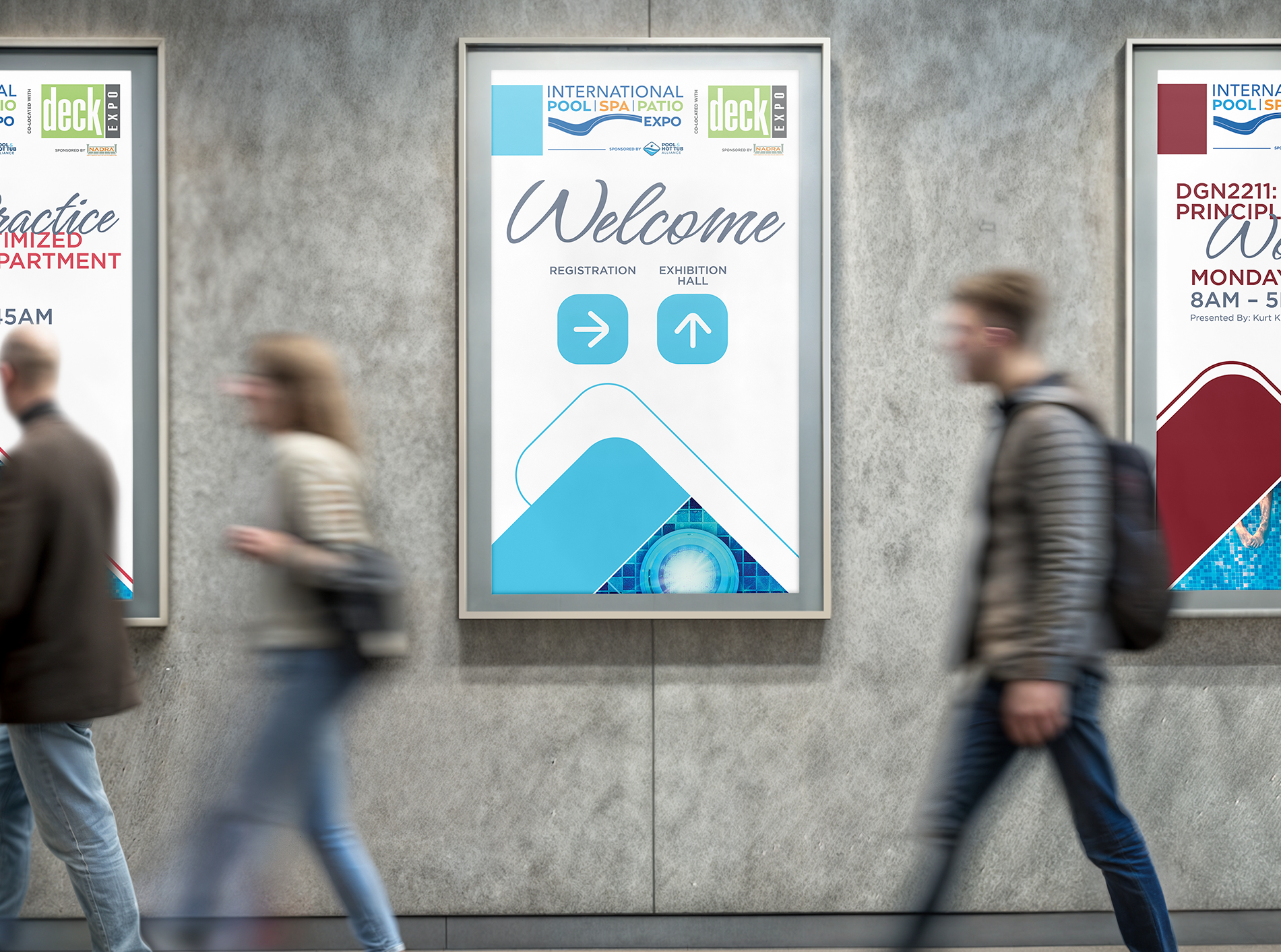
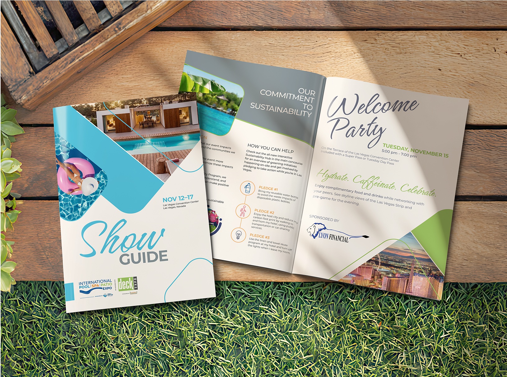
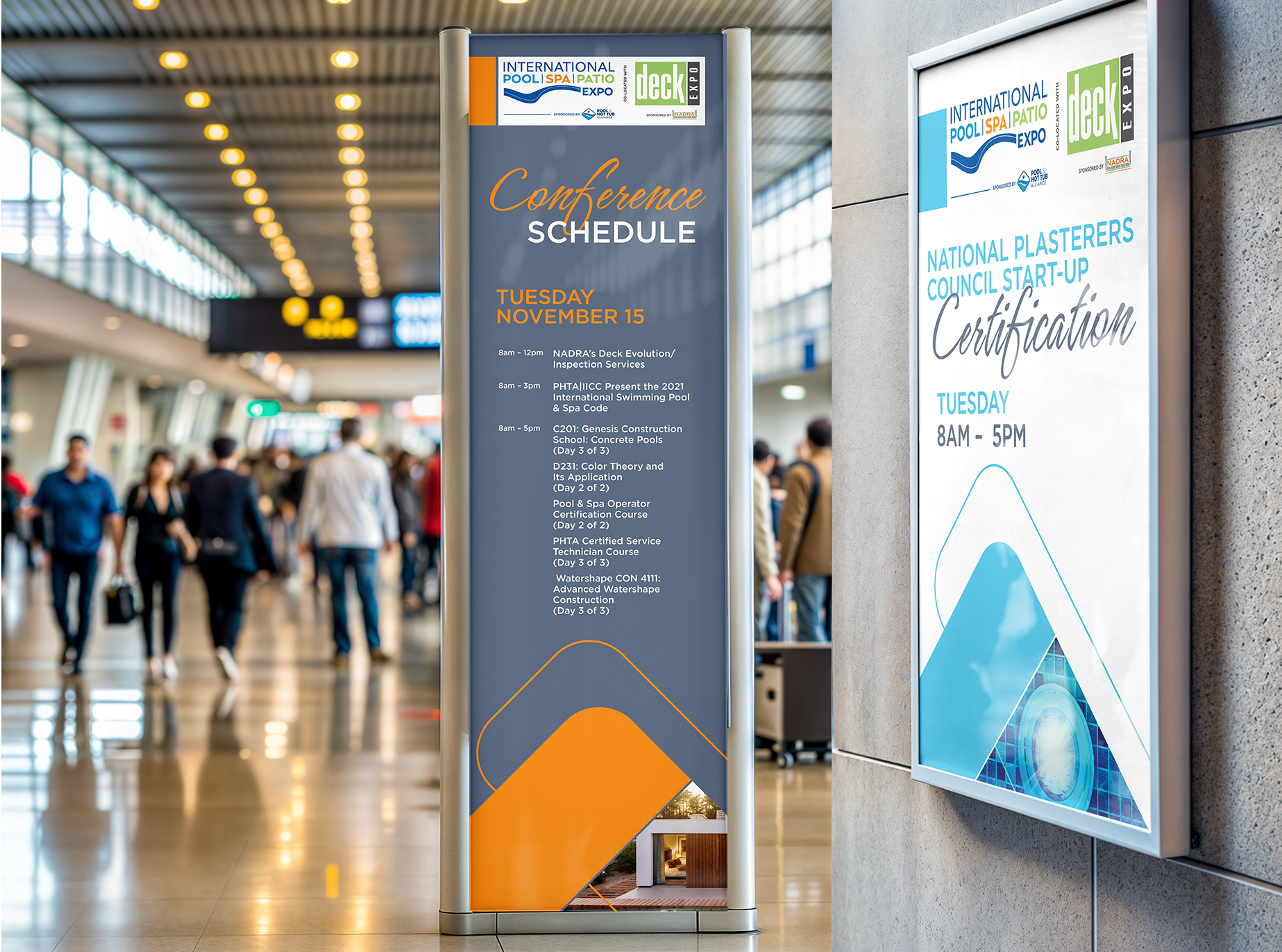
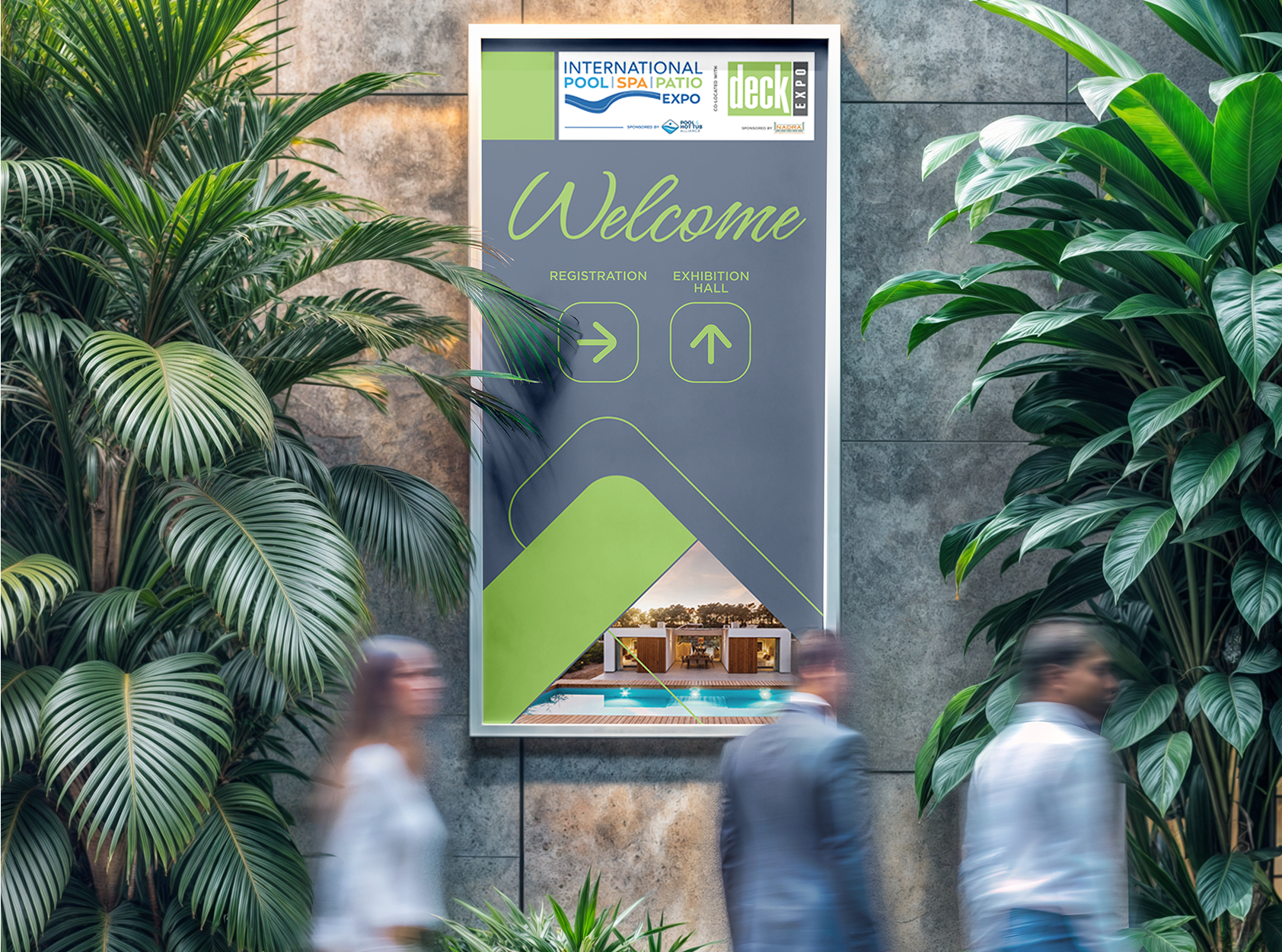
- Applied everywhere — The system rolled out across magazine and print ads (with pool and deck variants), multi-size digital banners, environmental and wayfinding signage, web banners, and website design direction.
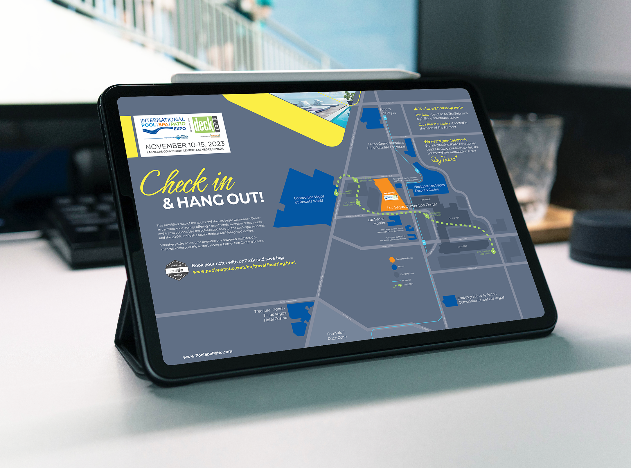
- Extended across years and cities — We carried the identity forward across event cycles and into new deliverables, including custom wayfinding maps for Las Vegas (“Map It & Meet Up!”) and Dallas (“Check In & Hang Out!”).
The Results
- A unified, deployable brand — one documented system: guidelines, website style guide, and a full template library. Allowing internal teams and outside vendors produce on-brand work without re-inventing the look each cycle.
- A co-location problem, solved — “Dive In and Deck Out” and the mandated pool/deck photography mix gave both audiences equal footing in one brand.
- An audience-right identity — confident, contrast-forward, and masculine-skewing, aligned to the show’s real builder-heavy audience.
- Proven longevity — the identity anchored the marketing program across multiple event cycles and two host cities, extending cleanly into new formats like environmental maps. Establishing a complete design system, not a one-off campaign.
Summary
Bluecap gave PSP/Deck Expo a brand as confident as the show itself and one it could own. The “Dive In and Deck Out” system resolved a co-location identity crisis, matched the audience, and proved durable enough to carry the #1 event in its industry forward, year after year, city after city.